Life
amplified
ZEEHO Logo
The ZEEHO logo is transliterated from the Chinese brand name “极核(Jihe)” which means “extreme” and “core”.
The symbol is inspired by the brand mindset and the core value of INTERACTIVE. The aim is to design a simple but strong logo that combines a graphical element and typeface.
The “double E” symbol implies the brand’s attitude to break the rules, to be different – without compromise.
ZEEHO DNA
Unique, No limits, No boundaries
The unequal sign in ZEEHO logo describes our guiding philosophy in sustainability, technology, life attitude, and a brighte tomorrow.
Dare to be unique, break limits and boundaries, and always forward to a sustainable future are driving us every day to create new possibilities across the globe.
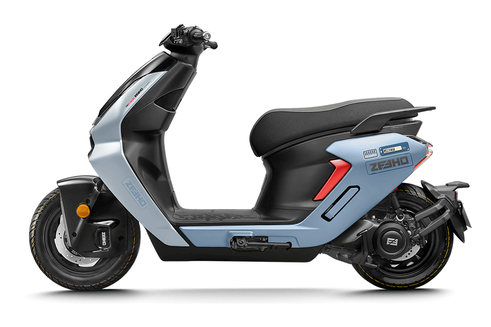
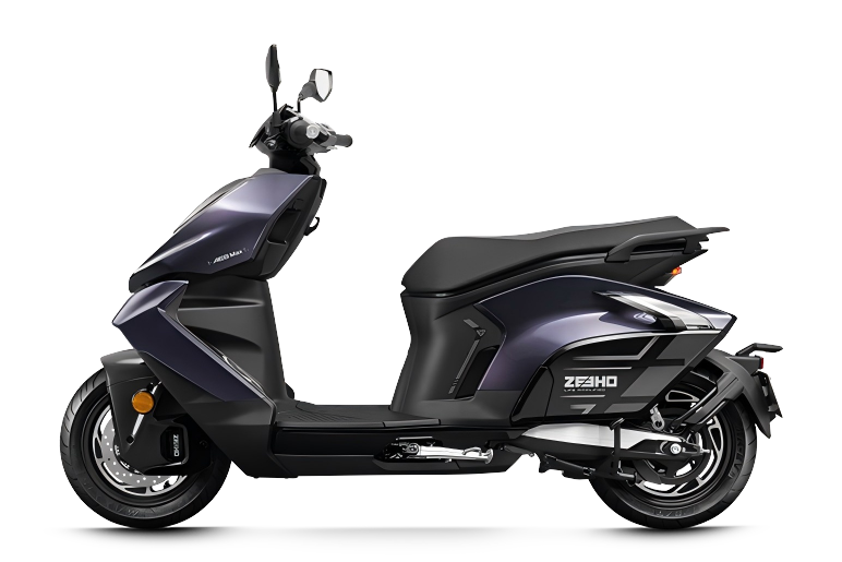
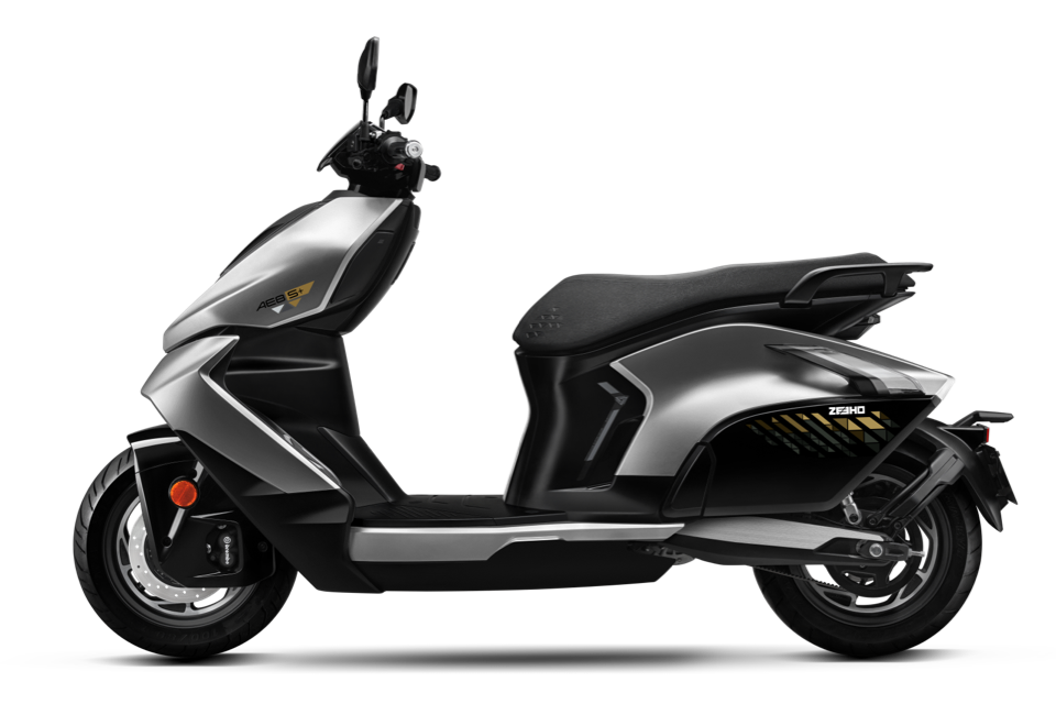
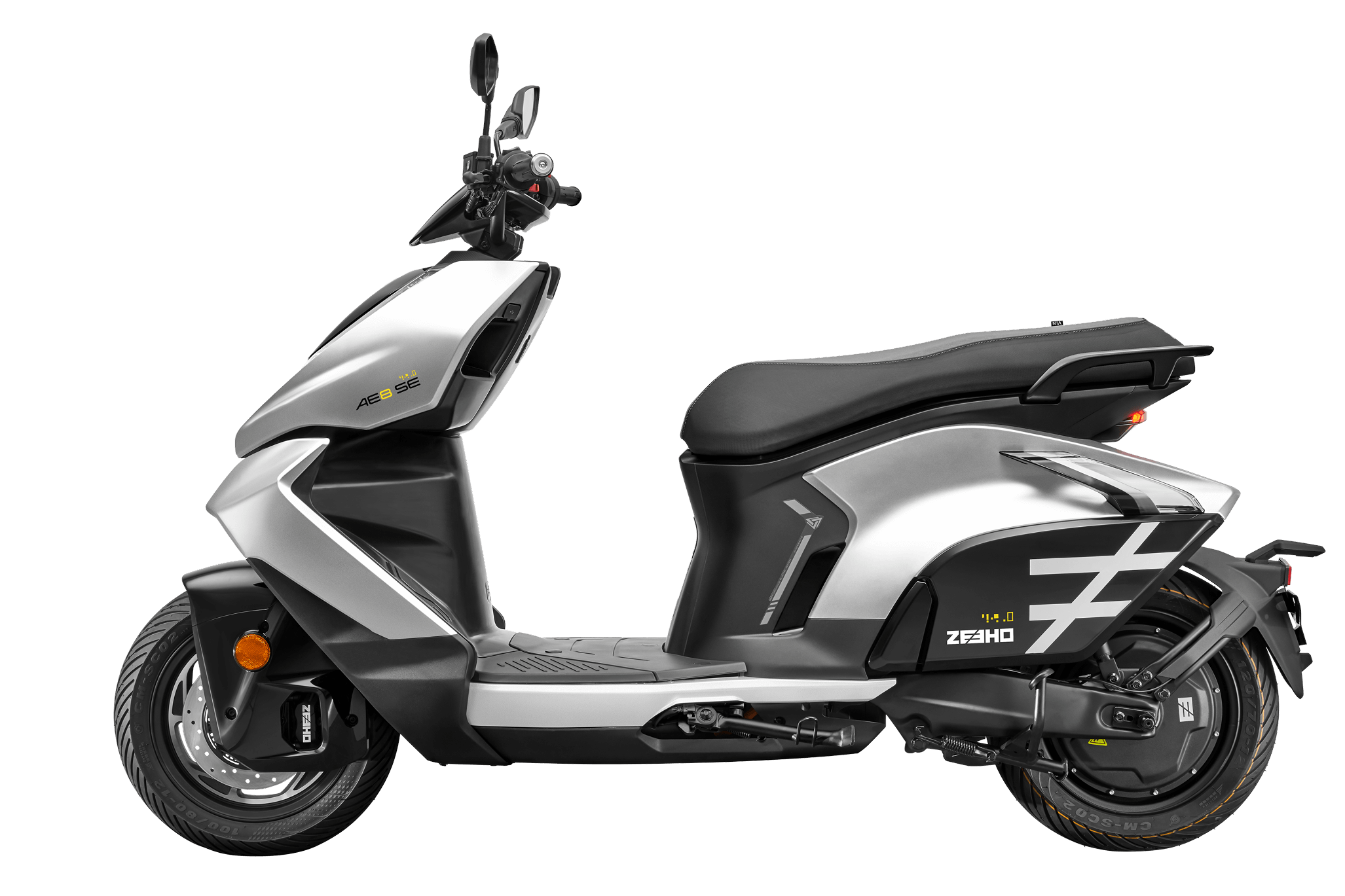
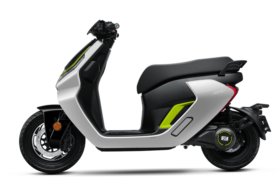
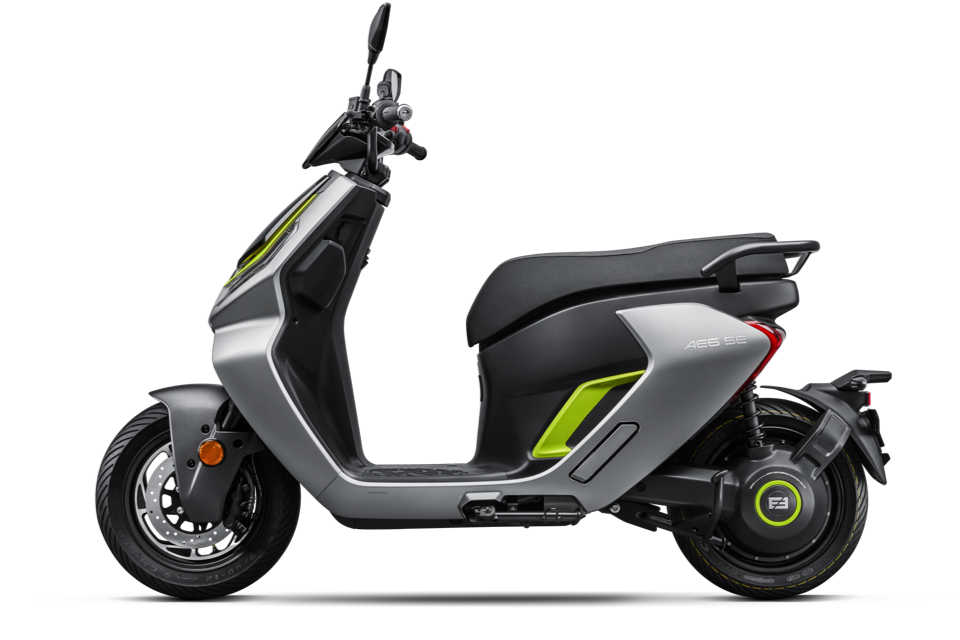
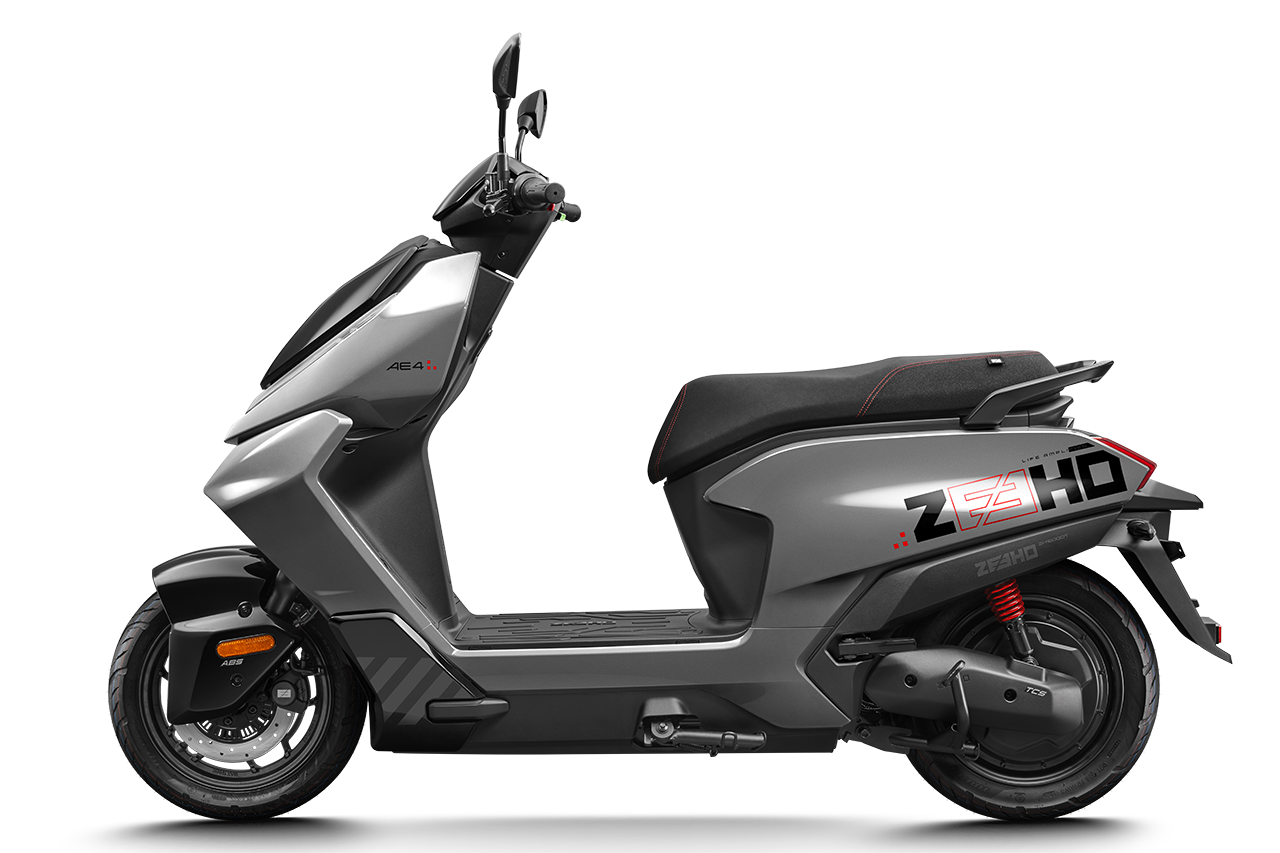
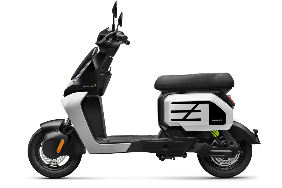
Brand Position
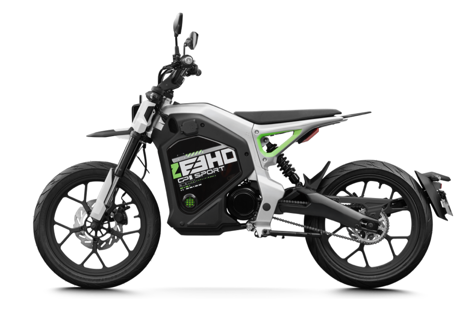
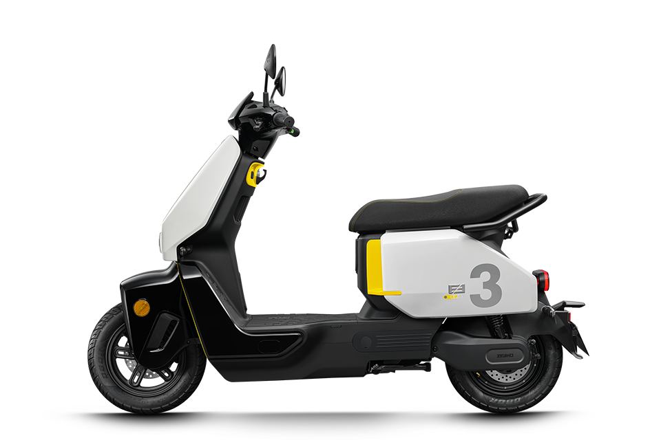
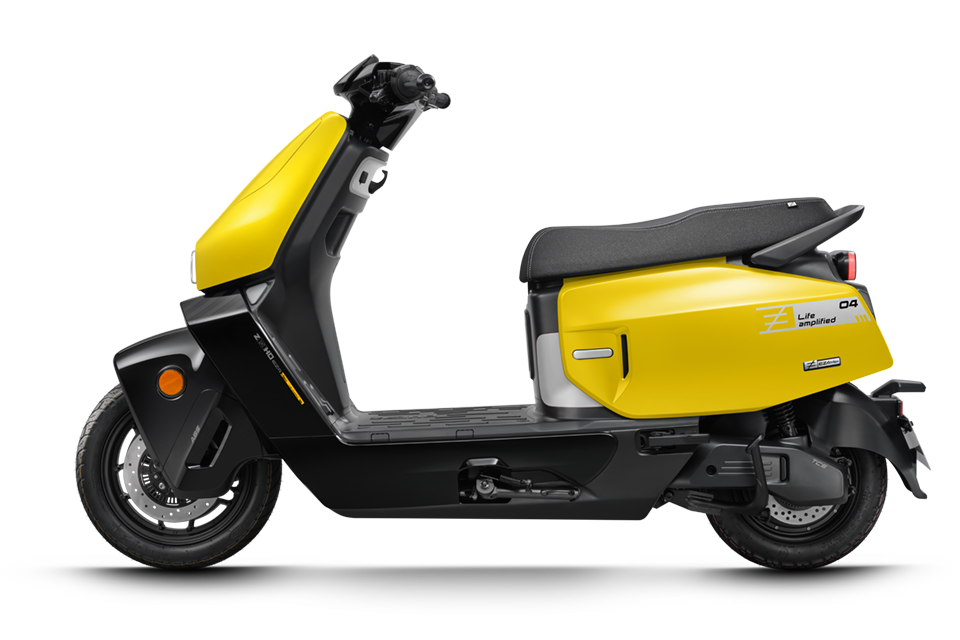
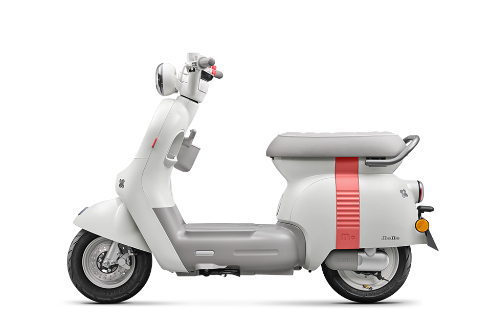
An Urban Mobility Brand
Leading the global electric mobility trend, more than just ride. ZEEHO is an incredible experience and a premium lifestyle. Your high-performance travel companion. Come together, and make life amplified.